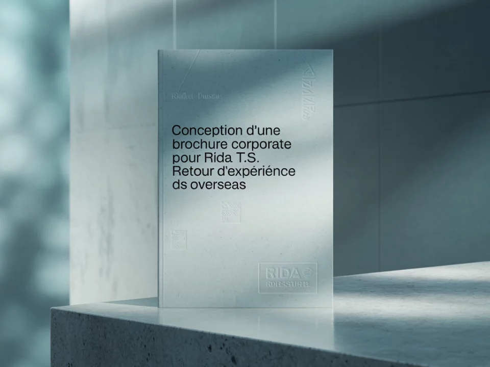
Drawing up a graphic charter booklet
For our client RIDA TS, we took charge of setting up a graphic charter.
This document is essential to ensure the visual consistency of all the company’s communication media.
The graphic charter lists the visual elements that represent the company’s identity, such as logo, typography, colors and images. It also defines the rules for using these elements consistently across different media, such as the website, printed materials and advertising.
In creating a corporate identity for RIDA TS, we ensured that it perfectly reflected the company’s modern, professional image. We chose an elegant, uncluttered color palette, with shades of dark blue and gray to represent reliability and trust in our customers.
In addition, we created a simple but striking logo, using the initials of the company name and a symbol representing the internationalization of RIDA TS.
For the typography, we opted for a sans-serif font that reinforces the company’s modern, professional look. We also included rules on the size and placement of the logo on different media to ensure its visibility and consistency across all our documents.
Finally, we’ve reworked the logo’s main iconography to make it more graphically relevant. This allows users to easily identify the services they are interested in, and to have a clear understanding of what our company offers.
We also worked on the color codes of the primary and secondary logos to adapt them to the international markets in which we operate. Shades of blue and green reflect our commitment to sustainability and the environment, while red adds a touch of energy and dynamism.
We took care of the logo’s format variations as follows: Horizontal and vertical, Latin and Arabic, positive and negative black and white, to guarantee optimum visibility in all situations.
We have also emphasized the standards of logo use, to ensure visual consistency and a strong brand image in all our communications. This includes the use of the logo on all communication media, whether paper or digital screens.
In addition to the logo, we have also developed a font and color guide to ensure graphic unity in all our content. We have selected modern, legible fonts to enhance the readability of our content and reinforce the professional image of our company.
We are confident that these changes will bring a consistent and professional image to our company, while effectively communicating our values and services to potential customers. We remain committed to providing innovative and sustainable solutions worldwide.

