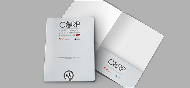

CORP training certificate
We designed, formatted and printed 31 certificates corresponding to a training course developed by our customer CORP.
The certificate, in 26 x 20 cm format, was printed in digital offset on 300g four-color paper.
Designing a training certificate
Designing a training certificate is an important task that should not be taken lightly. The certificate represents the hard work and dedication of the person who has completed the training, so it’s important to ensure that it looks professional and polished.
How do you design an aesthetically pleasing certificate?
When it comes to designing a training certificate, it’s important to ensure that it’s high quality and professional. It reflects the hard work of the person who has undergone the training, and it’s important to make sure they’re proud to show it off. Here are a few tips to make sure your certificate looks its best.
- Use high-quality paper.
- Choose a professional font.
- Make sure the layout is clean and organized.
- Use images or graphics to add interest.
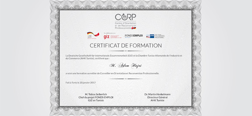
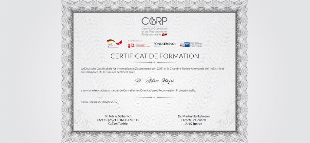
CORP training certificate
What goes into designing a certificate?
There are a few things to think about. The most essential aspect is to ensure that the certificate looks professional and polished. To achieve this, you need to use high-quality paper and a formal font. The layout should be clean and organized, and you can add interest by using images or graphics. If you want the certificate to be truly unique, you can also be creative in its design. However, it’s important to keep the overall look professional.
Mission carried out in January 2017

